ARTIST STATEMENT
ARTWORK AND PROCESS
RESEARCH AND
CRITICAL REFLECTION
CONTEXT
EXTERNAL RESSOURCES
AND PROFESSIONAL SKILLS
GALLERY OF RESOLVED ARTWORK
CAMBERWELL SPACE
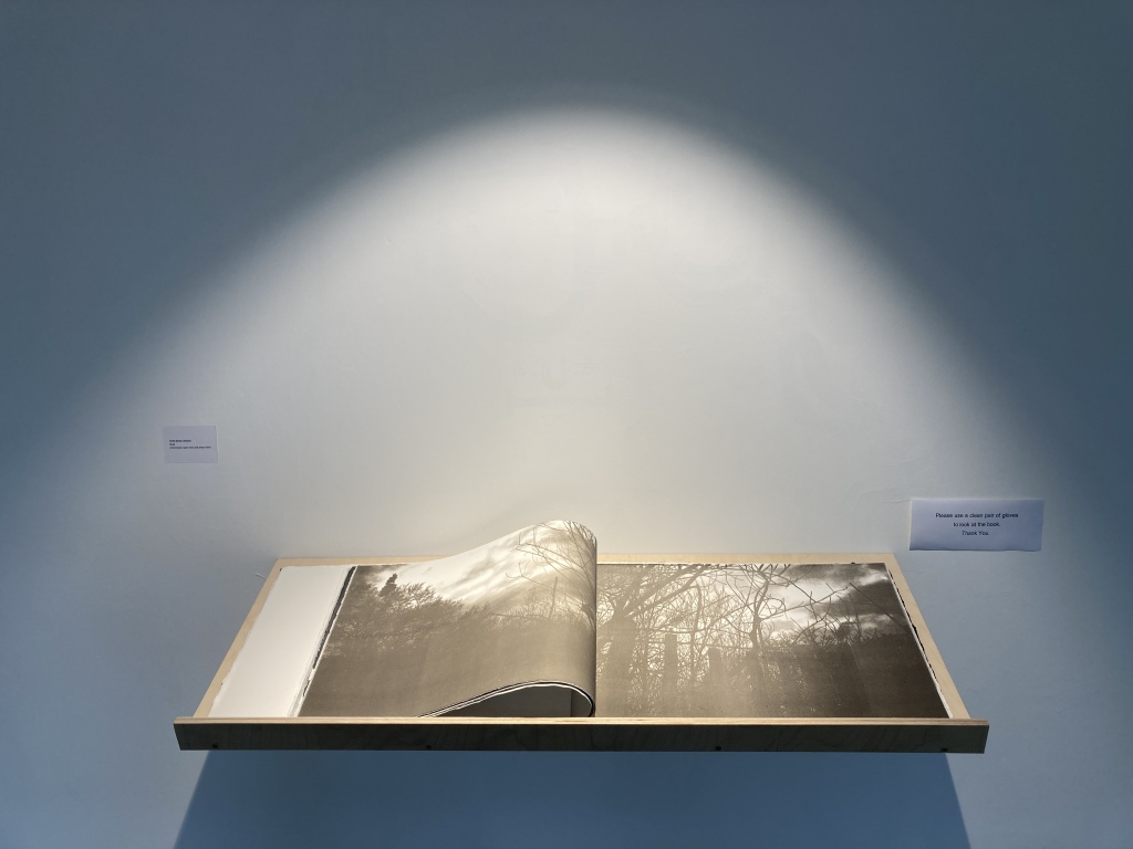
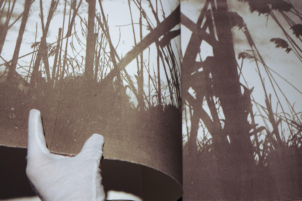
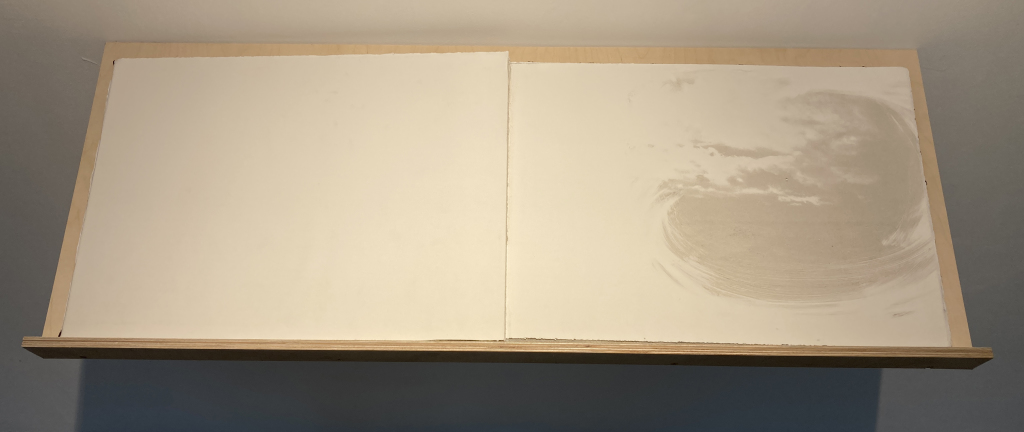
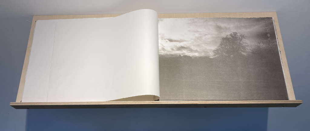
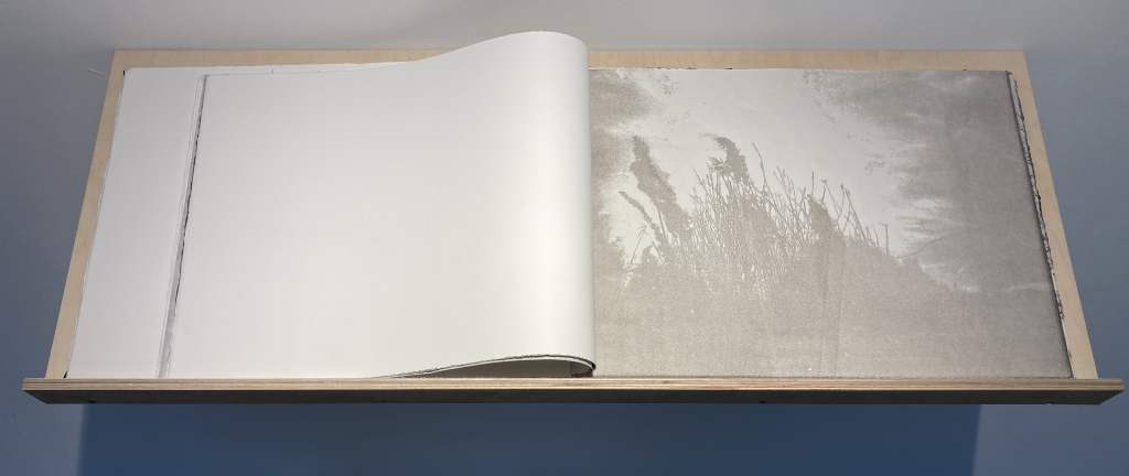
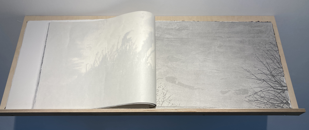
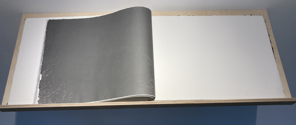
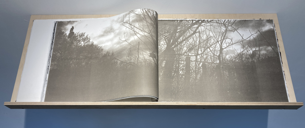
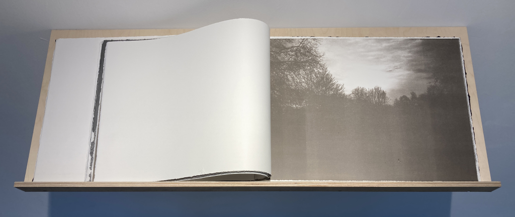
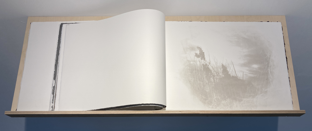
For my graduate show at Camberwell Space I made a photobook, primarily with full-bleed images, but interrupted by a few fragile laser cut and thin Japanese paper pages. The book was represented on a slightly tilted wooden shelf and I provided cotton gloves allowing the audience to slow down and turn the pages.
Title: DUSK 56 x 38 cm, closed
COPELAND GALLERY
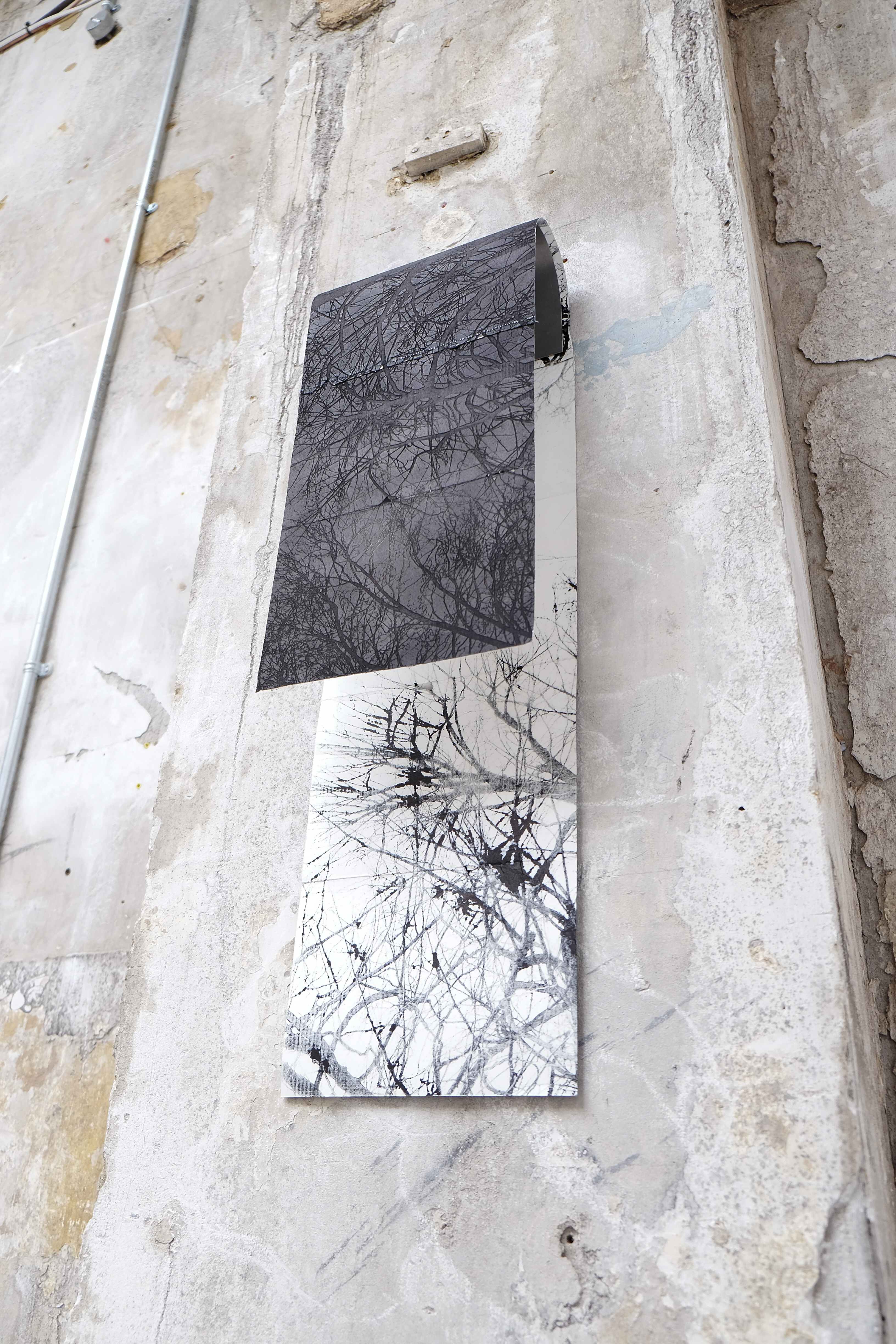
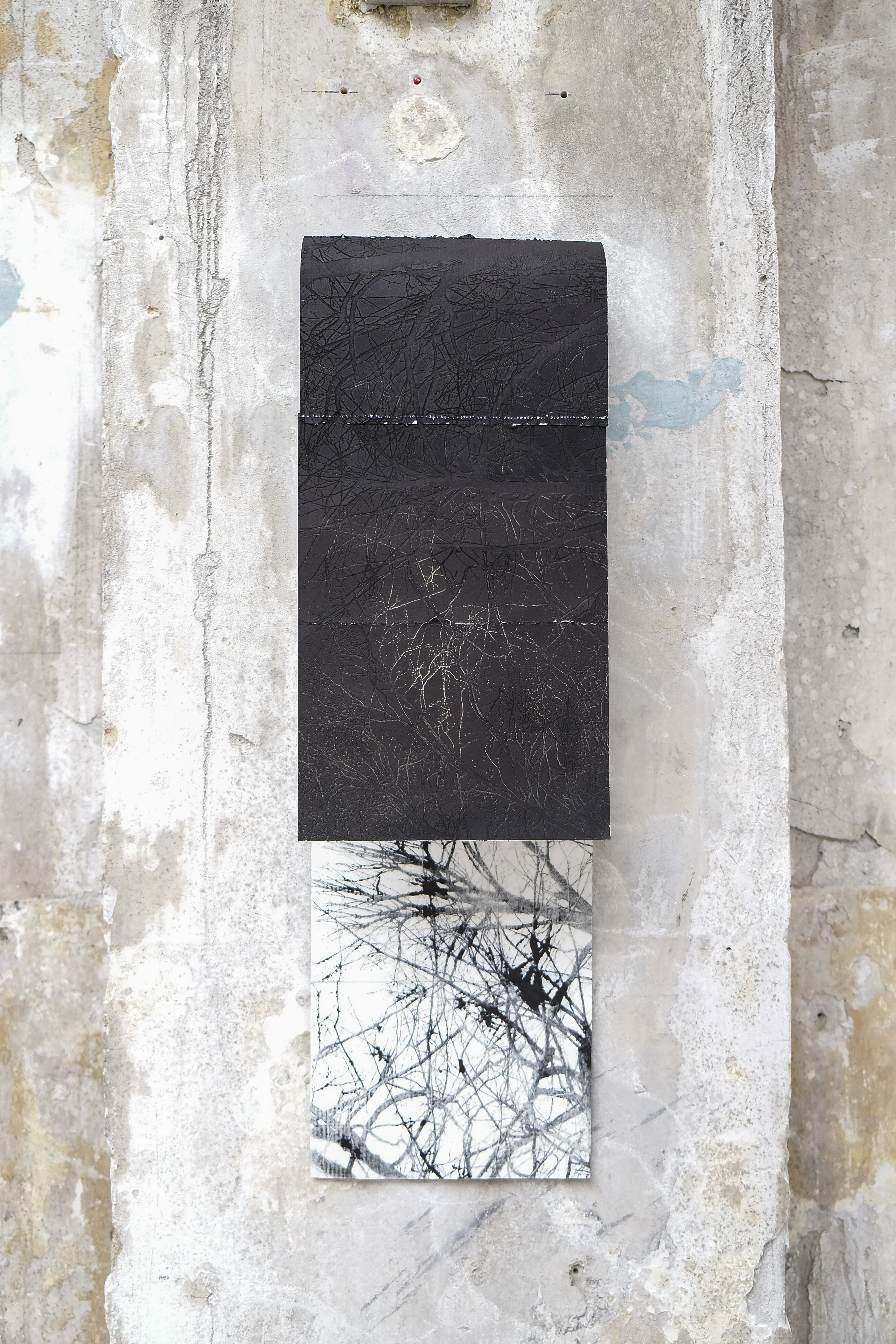
UNMUTE was a MAFA cross pathway exhibition at Copeland Gallery from 24-27 June 2021. My work for Copeland was a fragile laser etched paper, rubbed with etching ink so the black ink stained the inside of the work to create a duality between the two pages, between absence and present or haptic and optic.
Title: SHADOW 30 x 100 cm
COLLABORATION WITH GEMMA AND MARTA
I was really happy when Marta approached Gemma and me with a proposal to collaborate. We are interested in the same subjects and printmaking techniques, and therefore she suggested we each pick a place and express different interpretations from the same starting point.
The chosen places were:
- The Covid-19 Memorial Wall
- Between Southwark and London bridges
- St Mary's Church, Battersea
Gemma’s work is all about drawing and sound scores, while Marta creates imaginary landscapes and I work with photography. In the end we celebrated our collaboration with a pop-up exhibition at UAL and organized our work by location.
Untitled, various sizes
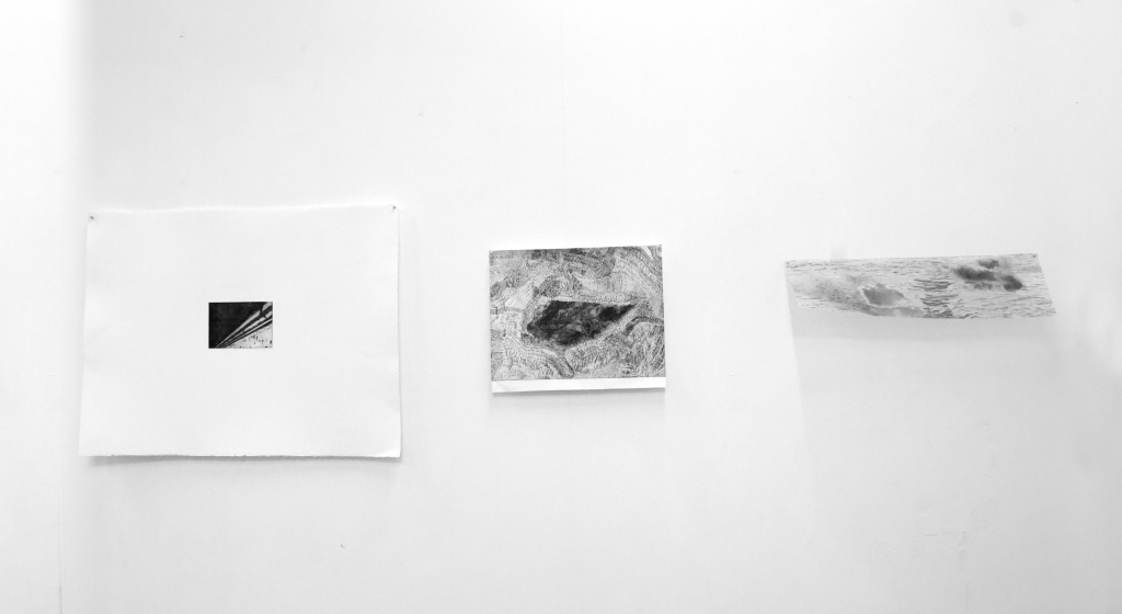
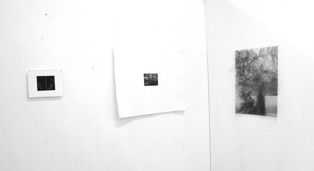
GALLERY OF SUPPORT WORK
DUSK AT CAMBERWELL SPACE
The starting point for my photobook DUSK is my digital photo archive from when I first arrived in London late 2020 and early 2021. As a tool to get an overview of the many photos, I printed contact sheets and it change the way I looked at the them. First of all, a lot of detail is lost in the small images which changed my focus from detail to bigger composition. Therefore, I intuitively began to look at the sky and the light, more that the naked tree branches. Secondly, I started cutting out the best images to make a rough plan for the layout.
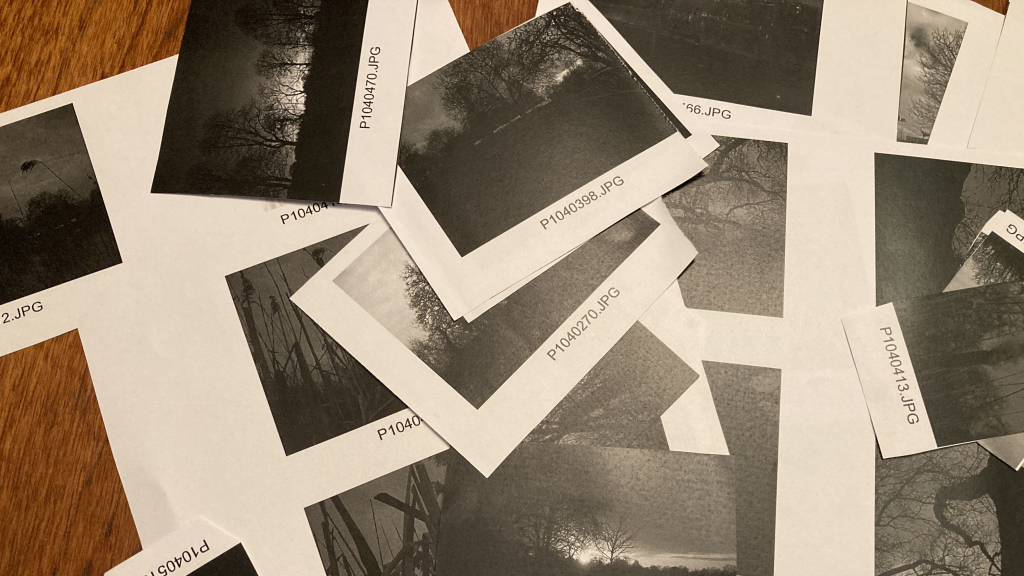
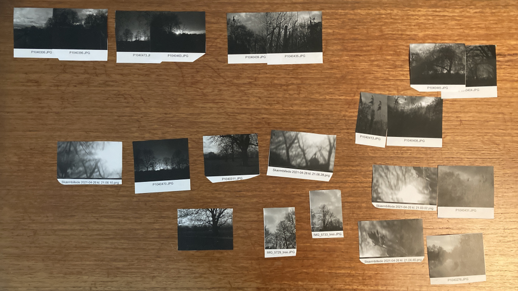
Contact sheet gave me an overwiev of my images.
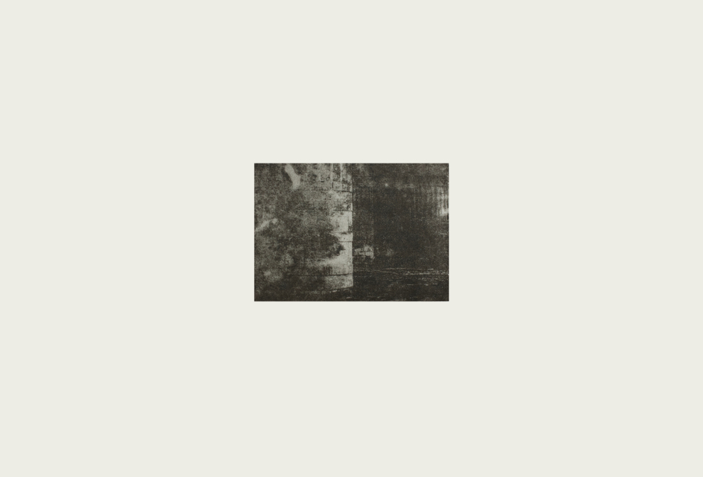
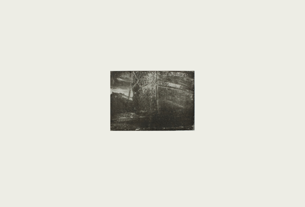
In my work I manipulate and process my digital photos to give them a physical existence. Initially I experimented with laser etching images on paper and use the transparency of the laser cut paper to create a double-sided effect. This worked really well for my work at Copeland Gallery (see Artwork and Process for further detail), but I felt a need to move forward in my search for the right printmaking technique for my images. Therefore, I started to experiment with different photo etching techniques such as hydro coat and image transfer directly onto the plate, but I wasn't satisfied.
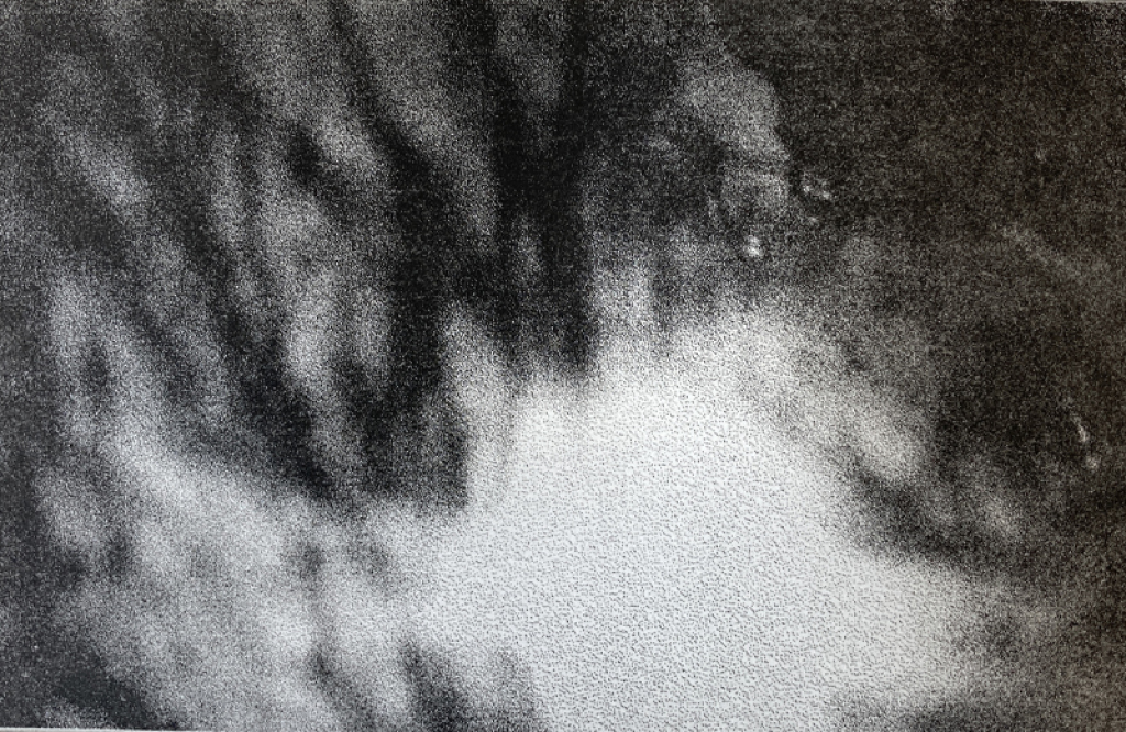
Example of hydro-coat and image tranfer photo etchings.
In the meantime, it felt like everyone kept telling me to use photopolymer for my print. I am deeply inspired by Tacita Dean's photopolymer prints with their soft, rich and velvety surface. I am also aware that her source material is grainy black and white photograph from old postcards, whereas my source material is digital photos without any grainy or ruptured surface, which I want to add to my images. Also, Dean adds to the surface by superimposing white handwritten notes in the style of film directions with instructions for lighting, sound and camera movements, suggesting that each picture is the working note for a film.
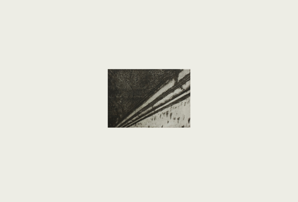
However, a series of events led me to try photo lithography. I immediately knew it was the right printmaking technique for my work because, simultaneously, my subject matter fell into place. The image below shows my first photo litho attempt, which was presented in a group crit with Jo and Paul.
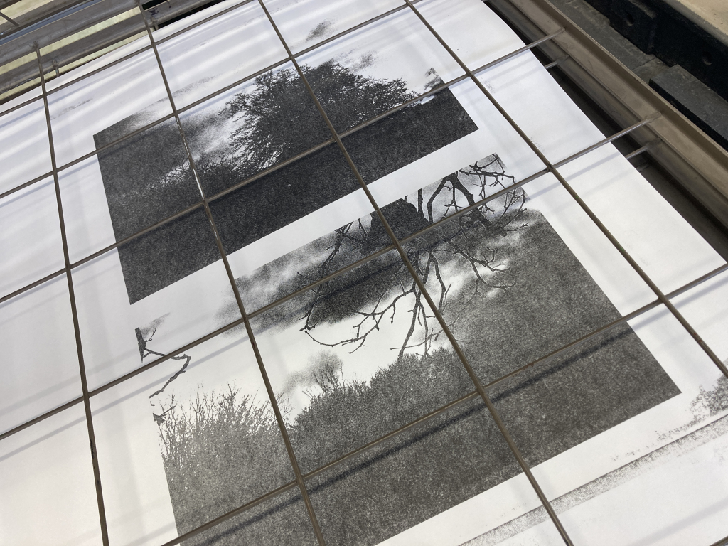
My very first attempt ever at printing photo litho.
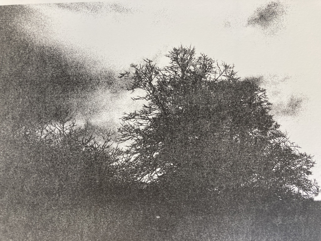
In the group crit Paul suggested printing the images as double plates to give the prints more depth and softness which was the last detail I needed to manifest my images in a way where image, surface and object have the relationship I am looking for.
Two plate printing made all the difference in capturing the mystic light of northern twilight and dusk.
Alongside my practical work I have been watching a series of Mellon Lectures at the National Gallery called 'Contact: Art and the Pull of Print', presented by Jennifer L. Roberts from Harvard University. These lectures give an overview of the history of printmaking as well as an insight into the way various artists have used printmaking as a technique to visualize their ideas and thinking.
It has been an interesting journey as I typically become fascinated with a printmaking technique and work from there instead of starting with my subject matter and finding a technique that enhances it. However, the process of forcing myself to let my subject matter (northern twilight and dusk) dictate my printmaking techniques, not the other way around, has enriched my practice.
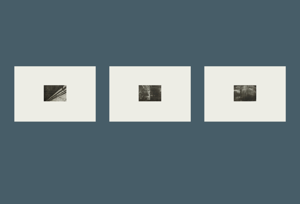
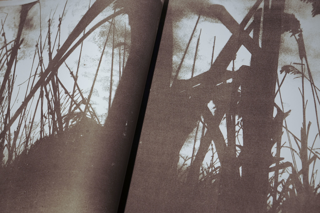
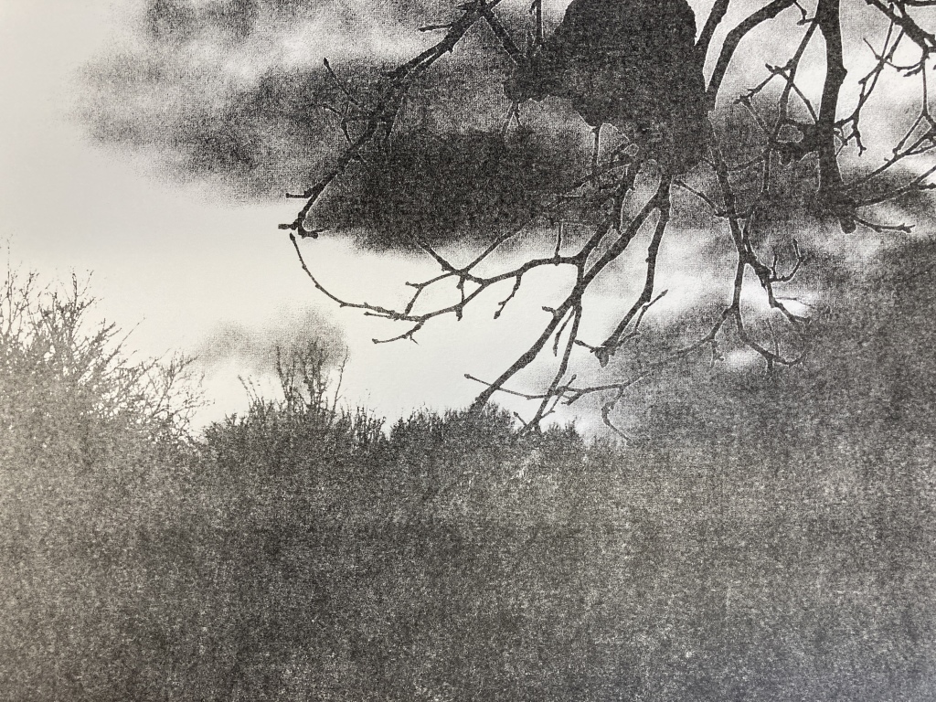
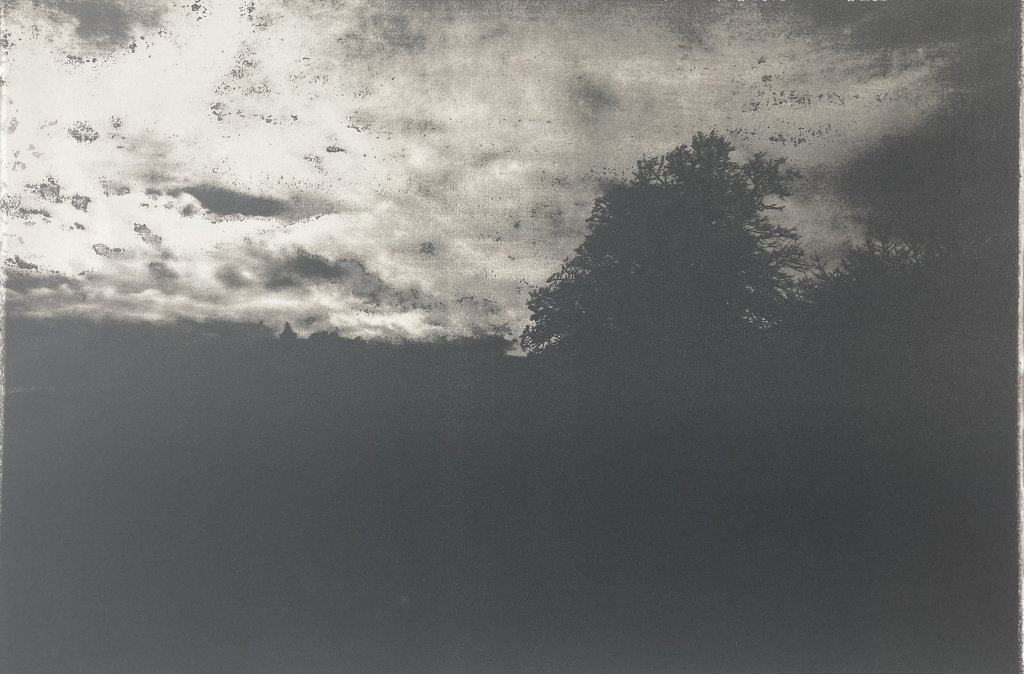
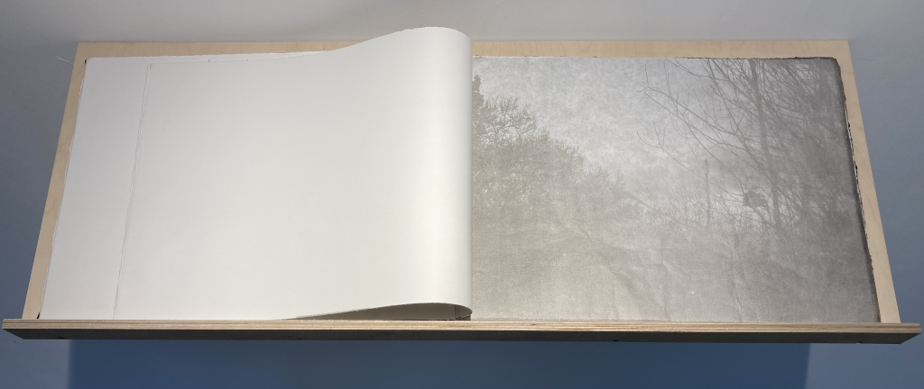
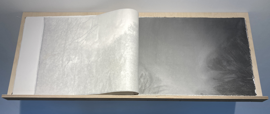
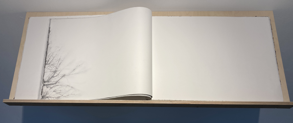
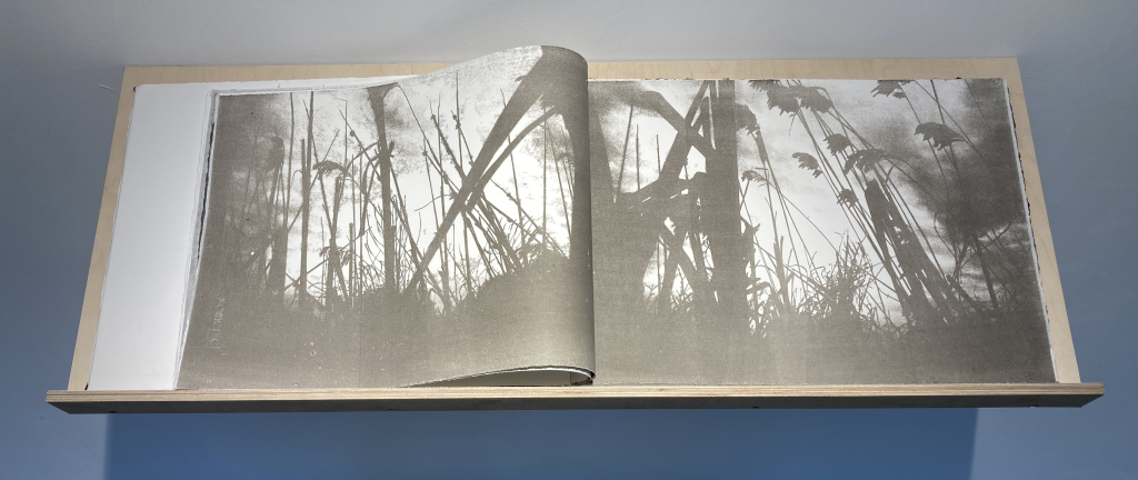
The following photos show all the double pages, as they occur in the physical book.
COLLABORATION WITH GEMMA AND MARTA
I will elaborate a bit more on my part of the collaboration and explain the choices I made.
First of all, I went to all the locations at low tide so I could go all the way down and stand on bottom of the river to take some photos and to make imprints directly on etching plates. However there was not access to the river from the the Covid-19 Memorial Wall.
Secondly, I decided to make all my images the size of a vintage postcard printed on a big piece of paper, hence it is a souvenir from my time in London and from my friendship and collaboration with Gemma and Marta. In addition, my technique of choice gives a dreamy look and feel, which support the narrative of memory.
The ideal exhibiting conditions for my images would be hanging on a dark wall (see last image) to emphasize the pull-inn effectintended by the large paper size.
Title: Memory From the Thames. Print size: 15,5 x 11 cm. Paper sizr: 76 x 56 cm